

Shaw Industries Commercial // Case Study
Shaw Industries was looking for a commercial to showcase their new company store location. The commercial would be geared towards friends and family of Shaw associates, and have text callouts featuring the unique perks the store offered to them. Talking with their producer, I learned they had some photos taken of the space, and some signage designed already. They needed someone they could count on to design and animate an engaging commercial from beginning to final video, providing creative input, generating ideas, making great use of their brand style and ensuring quality.


Style Frames
Above you can see a few different style frames I put together to give the team a few options for some visual directions we could take.
Option 1: A very straightforward recreation of some of the signage they had made. This would ensure alignment with marketing collateral they already had, while introducing dynamic animation that would engage the target audience.
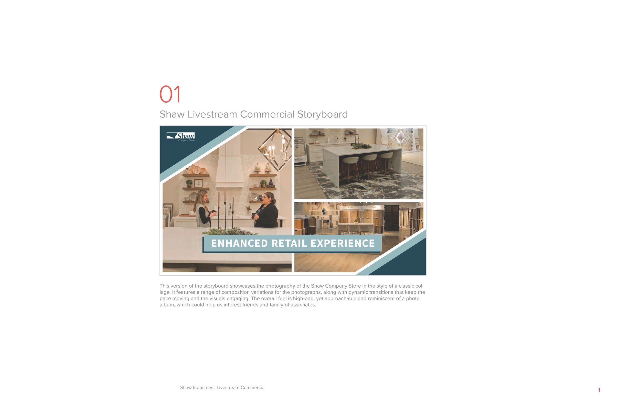
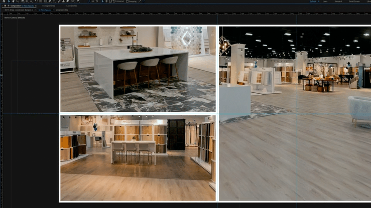
Option 2: This option introduced a collage design that I was inspired to create after reviewing their website and some of the other content they had created. It would showcase the photography of the store very well, allowing us to zoom in and show off interesting angles. This would also be reminiscent of a photo album, and since the commercial was geared towards friends and family I felt it would have a friendly and approachable feel, while still being dynamic and aligning with their established signage.
Option 3: Last but not least was a 3D animated version, with an eye-catching backdrop that would showcase a variety of representations of the kinds of flooring Shaw offered to their customers. Photos of the space made to look like polaroid pictures would be shown with dynamic animation, and immerse the viewer in a fun and engaging visual experience.

Storyboard
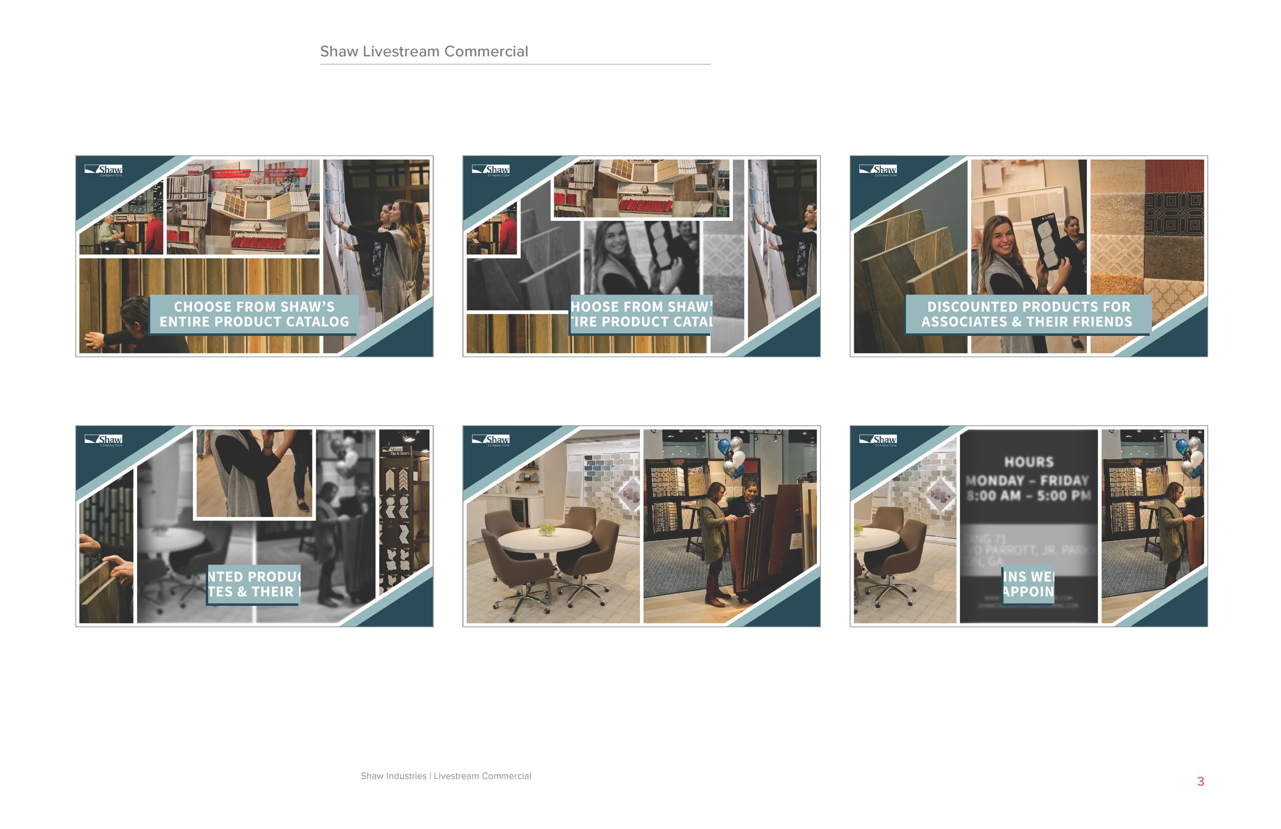
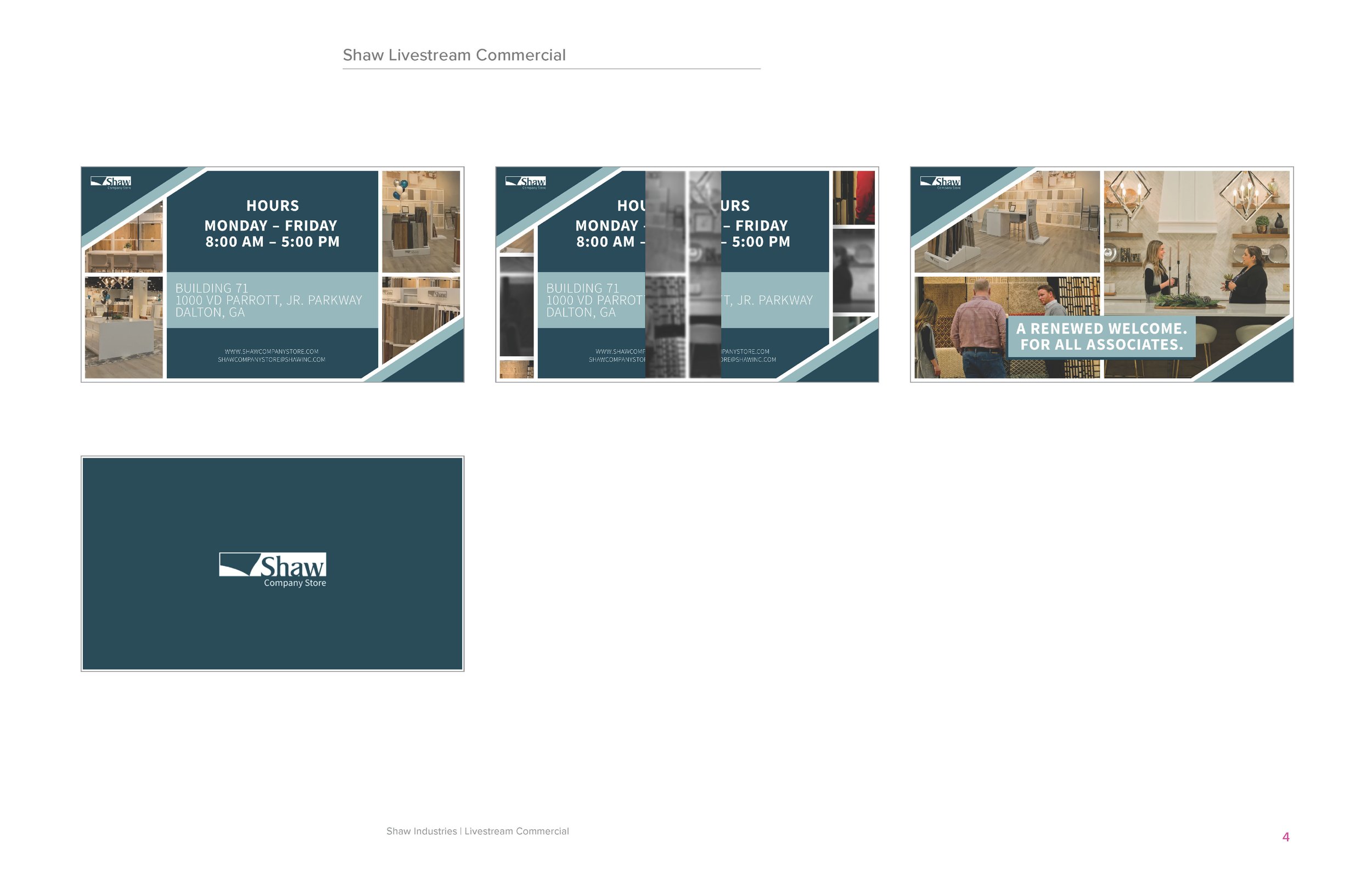
The team decided to go with option 2, the collage. They felt it was the best option for showcasing the photography of the space, and align with their goals for the project. I set to work crafting a storyboard for the video. I focused on keeping the design aligned with the elegant simplicity of the signage, while making sure the compositions of each of the collages was dynamic and visually interesting. Another aspect was making sure the photos made sense within the context of the callout they supported. I tried to keep in mind Shaw’s inclusive, team oriented brand ethos, and choose photos that allowed for some interpretation rather than being directly identifiable with any particular part of the callout. This also would help keep things interesting, and give a higher quality feel to the commercial.

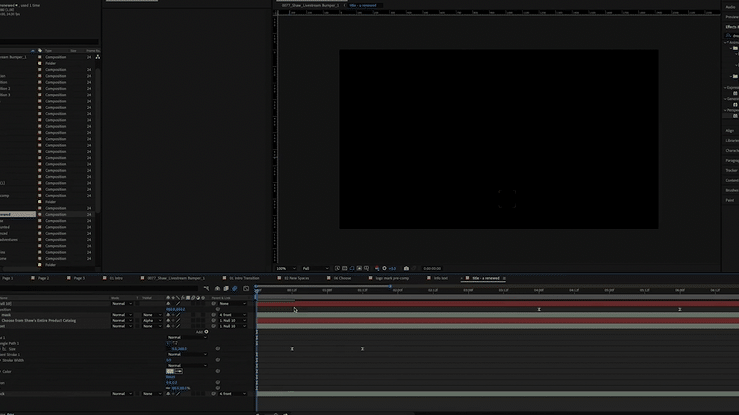
Animation
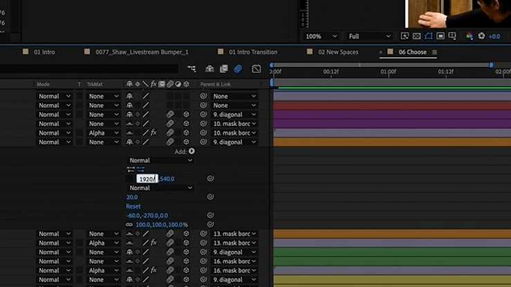
Once the storyboard was approved, I moved to the animation phase. This included animating transitions between the different collages, text reveals and a fun logo animation.
In order for the transitions to work, I had to make sure each of the segments that made up the collages was sized exactly right, or else when they separated from each other there would be some noticeable issues. They needed to fit together like pieces of a puzzle, within the 1920x1080 frame, and also include the white border. This involved setting out some gridlines and doing some math to get things just right. I love making things as organized as possible, and seeing the different image blocks align to perfection after a few calculations was very satisfying.

The Final Video
Before sending the final video, I submitted some changes to the copy which the producer liked and decided to incorporate into the video. After a few final tweaks the video was ready. I added in an upbeat soundtrack and sent it over to the team. Shaw was pleased with the final product!